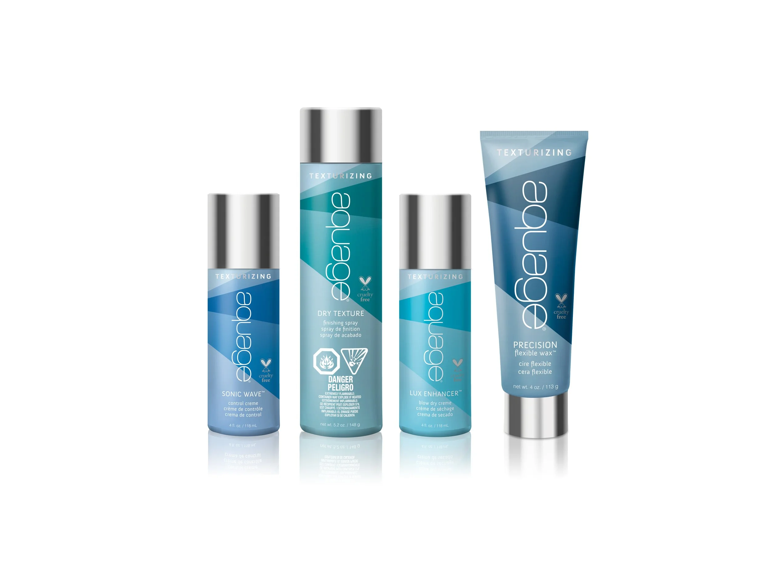
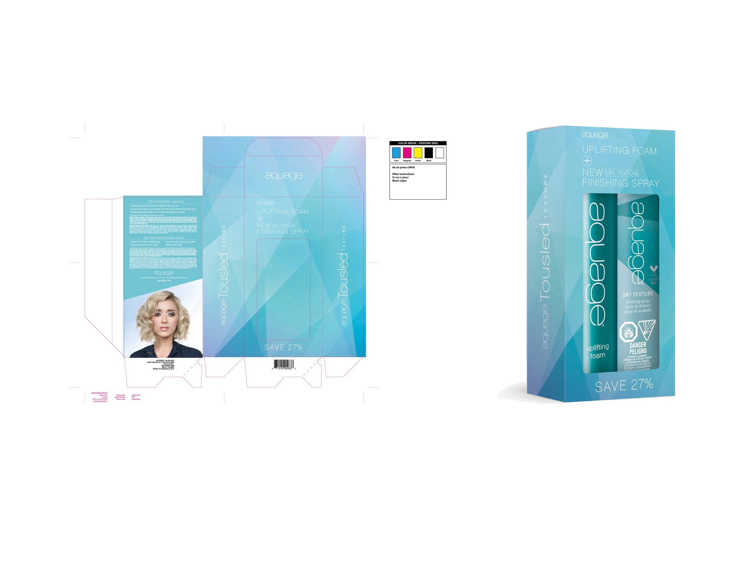
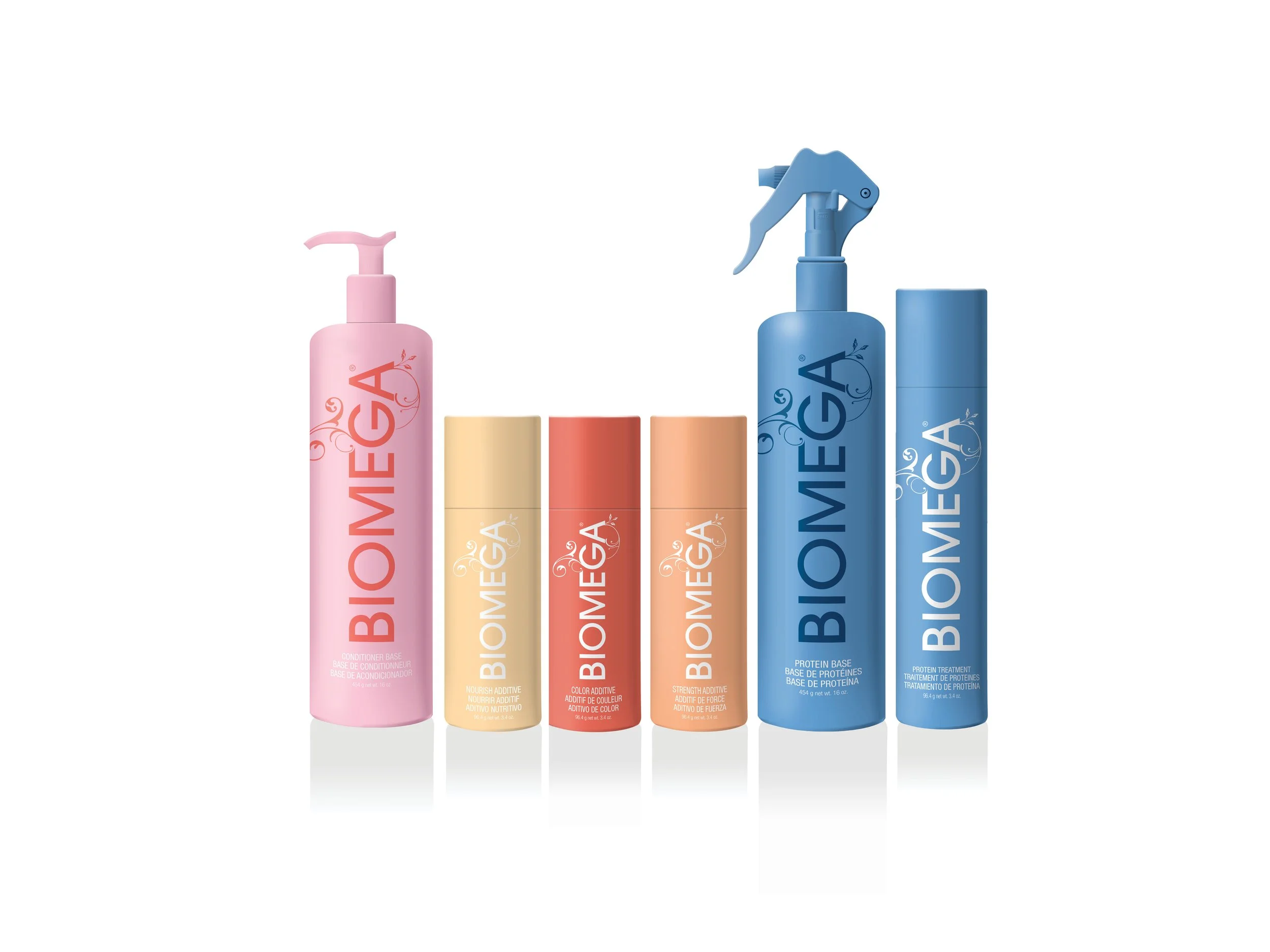
I helped develop print and digital communication, packaging design and renders for Beauty Quest Group brands of salon haircare products.
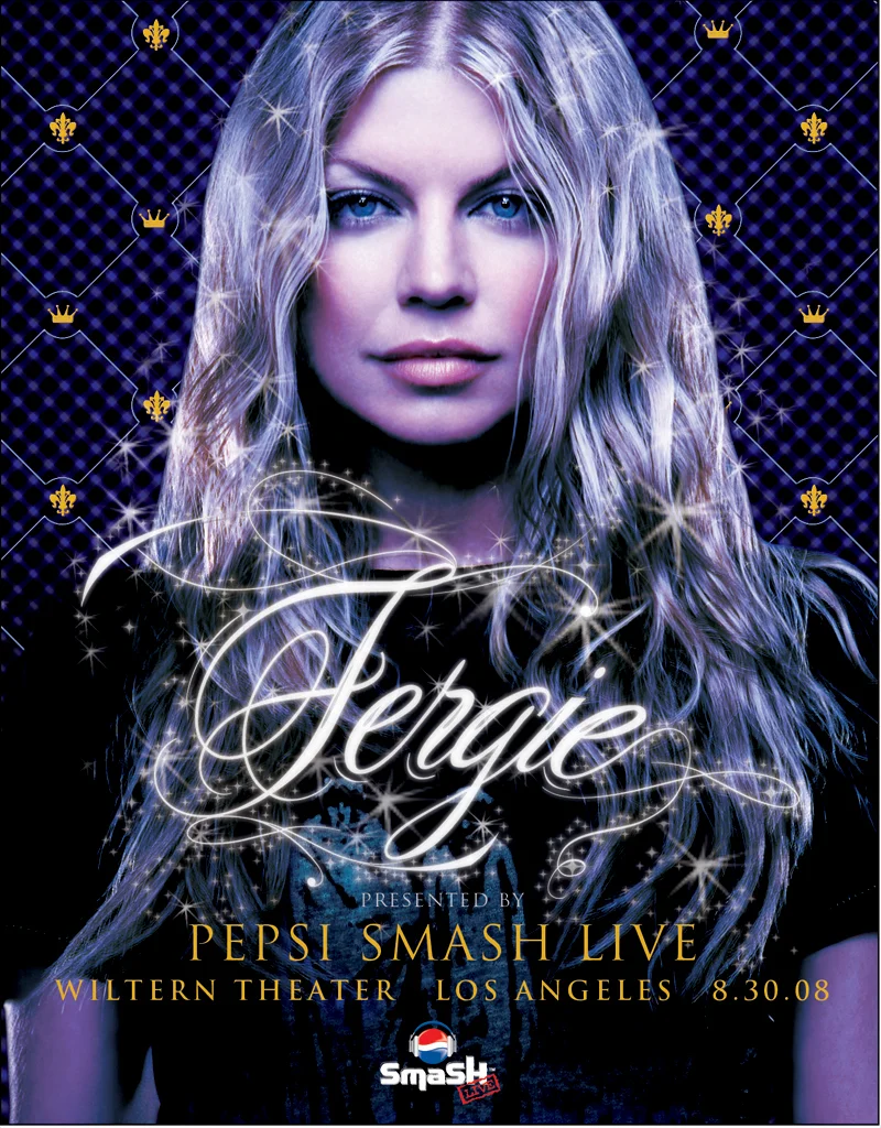
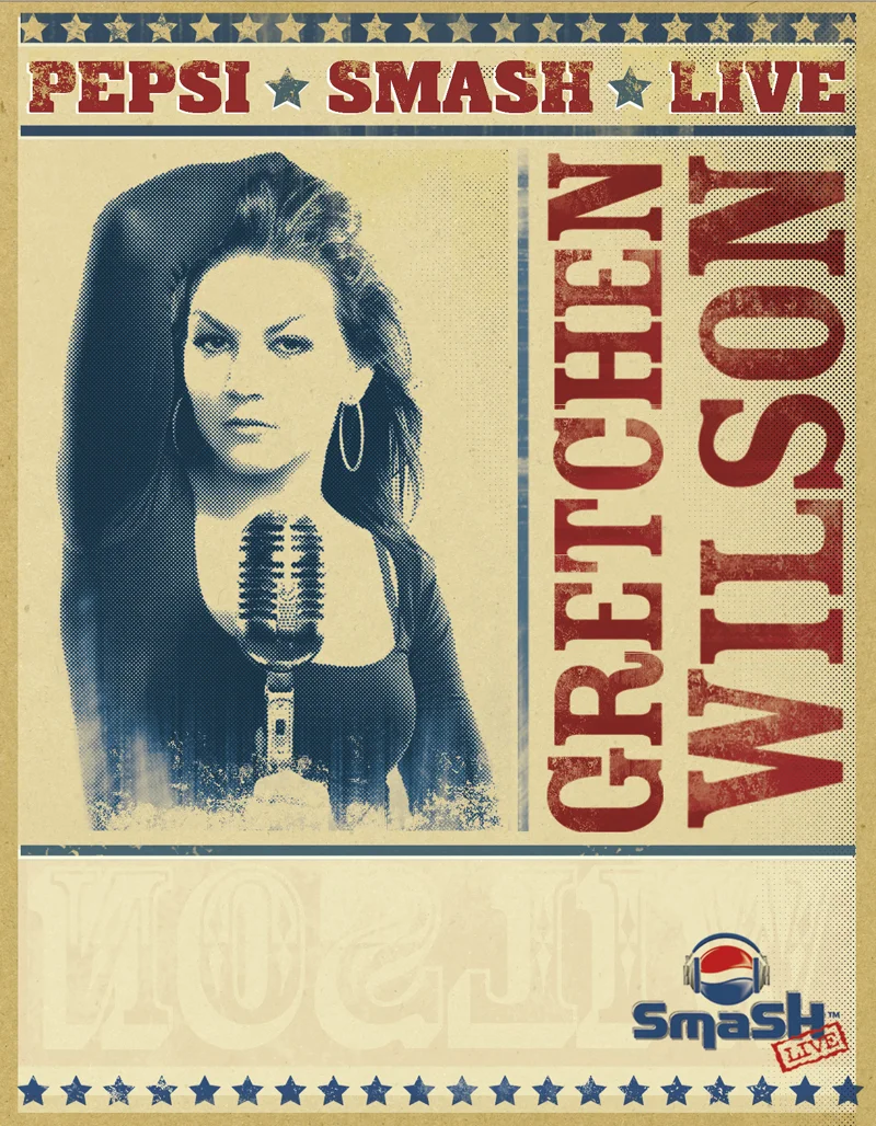
Billboard and posters designed to announce the concert series and were designed to capture the essence of the artist and their music.
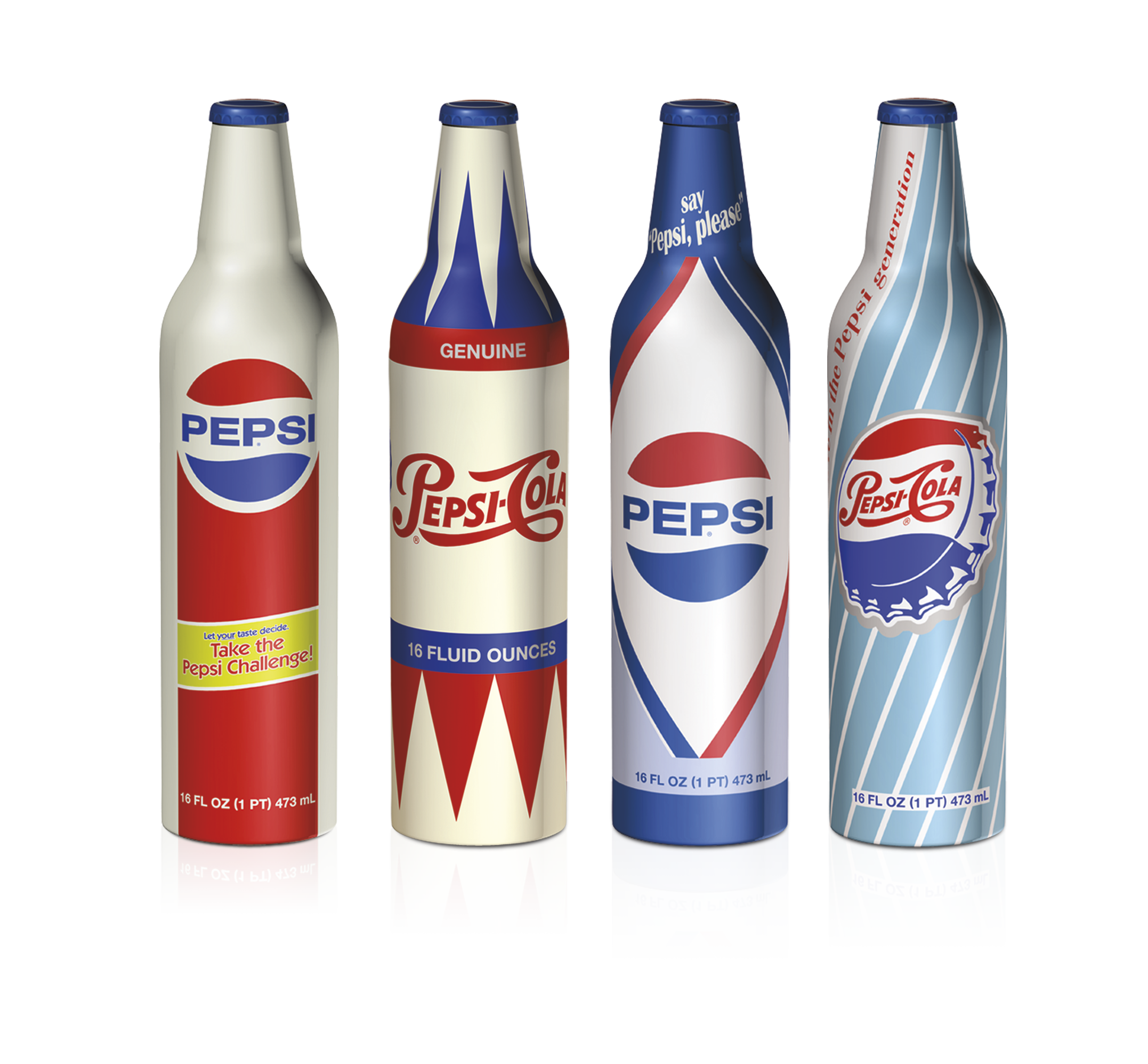
GOOD TASTE NEVER GOES
OUT OF STYLE
Limited edition bottles celebrating the different looks of each iconic decade
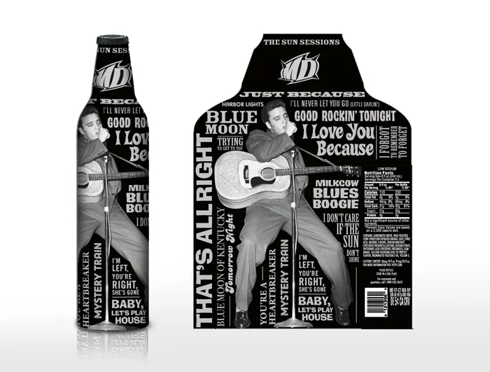
THE KING LIVES ON
PEPSICO is the official pour at Graceland. Mountain Dew aluminum bottles were developed to celebrate the relationship. Each bottle typographically represents different aspects of Elvis’s life: The actor, his nicknames and the song list from his first album recorded at Sun Records.
Unilever wanted to present a gift to the employees involved in the successful launch of Campaign For Real Beauty.
In keeping with the sentiment of the campaign, we established a catalog that each person may find what was uniquely beautiful to them.
We concentrated on personal, office and holiday themed items.
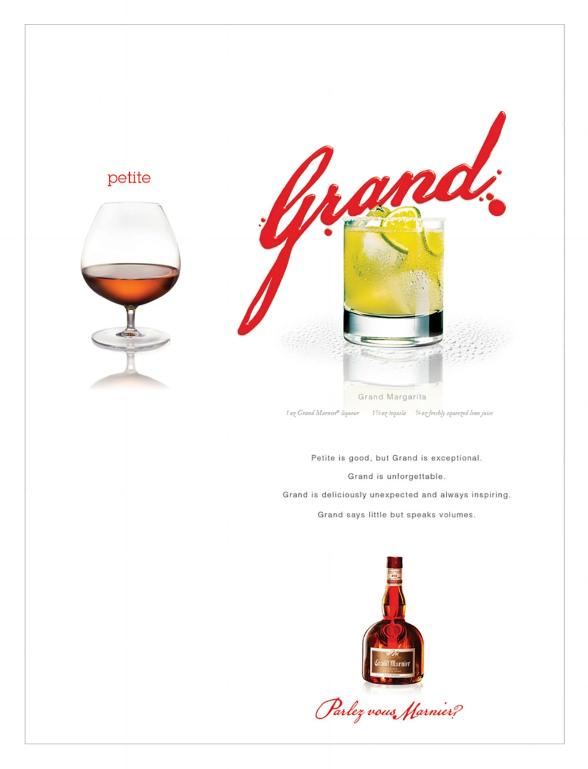
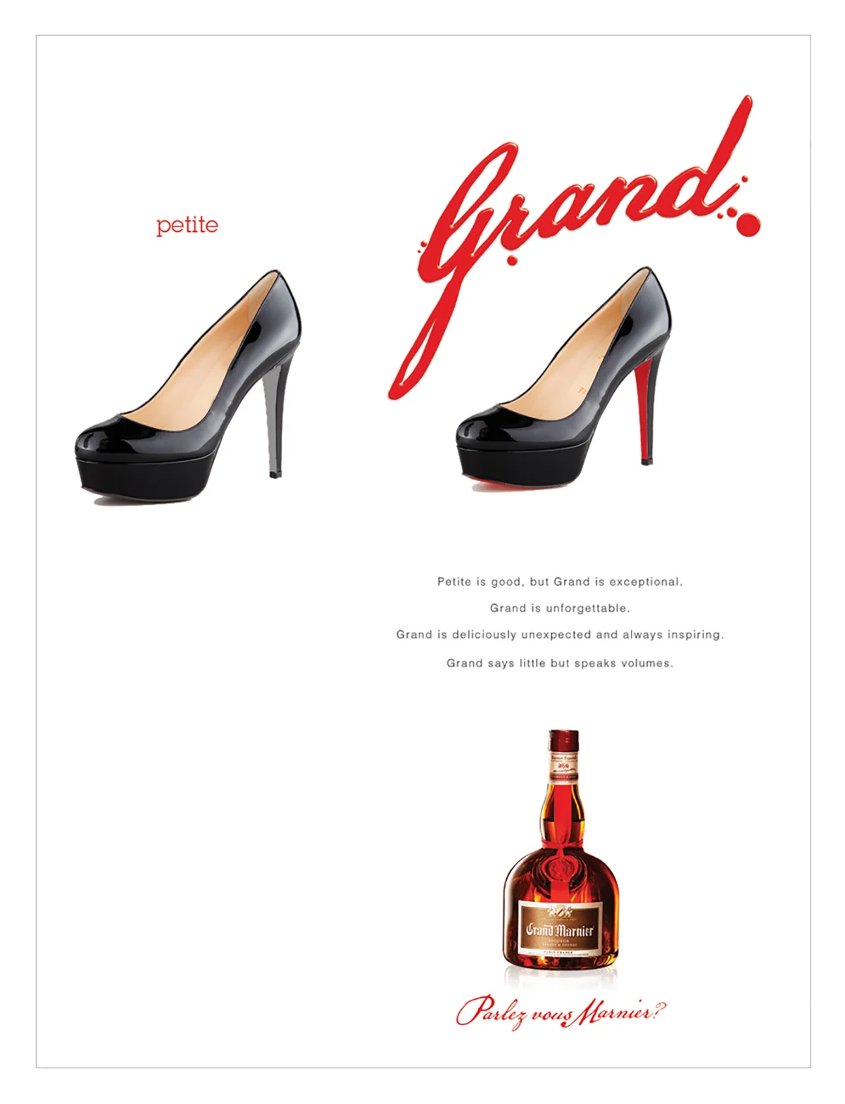
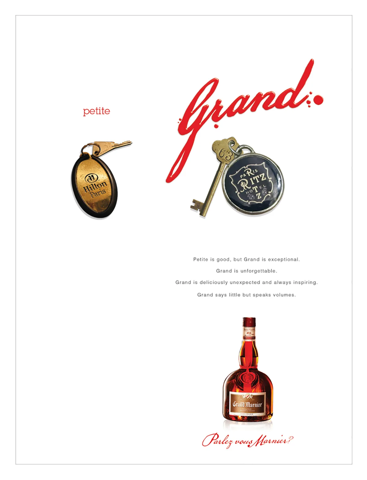
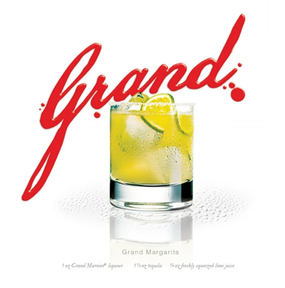
Grand Marnier wanted to show just how versatile and special their blend of cognac and bitter orange was.
The Living Grand idea and its imagery were completely theirs by using the red wax from their seal to bring to
life its point of difference.
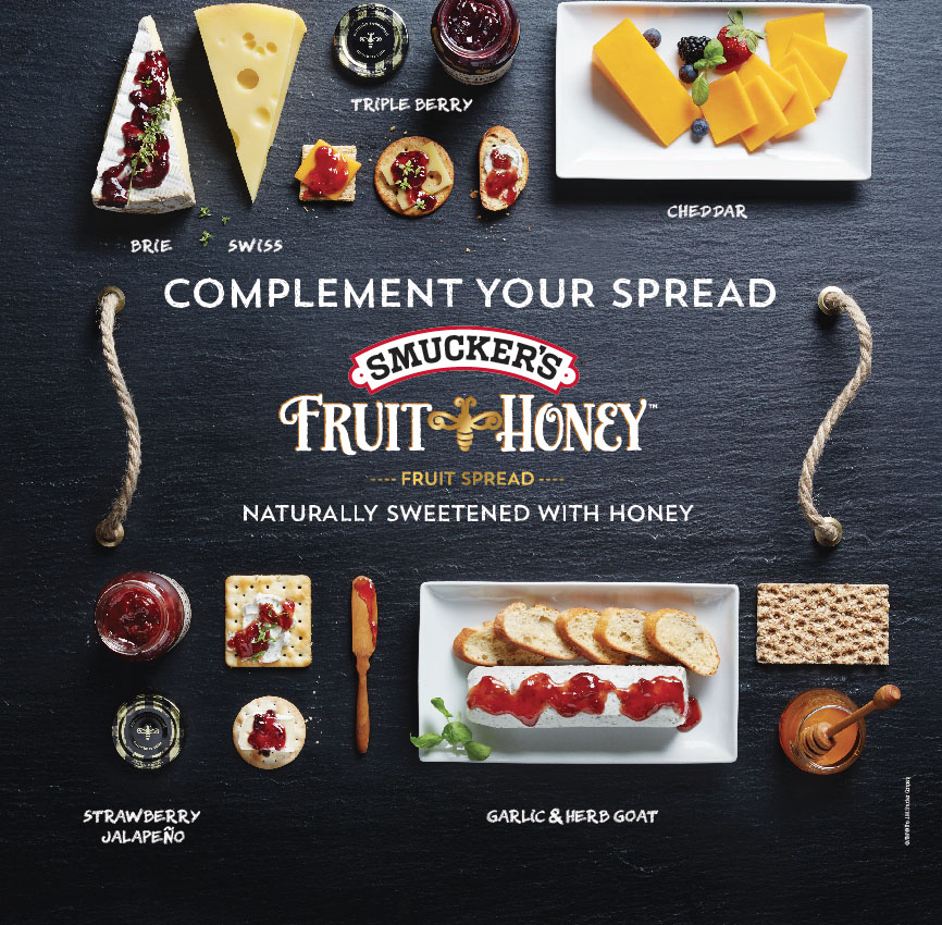
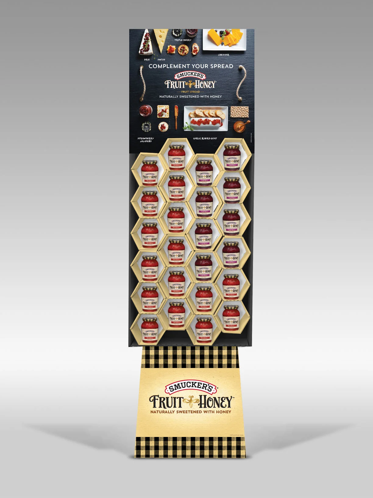
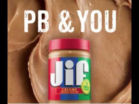
Smucker’s requested trending solutions to showcase the versatility and premium qualities of their spread sweetened with honey. A key visual was established photographing the image in different stages. Allowing for maximum flexibility for print, in store and online.
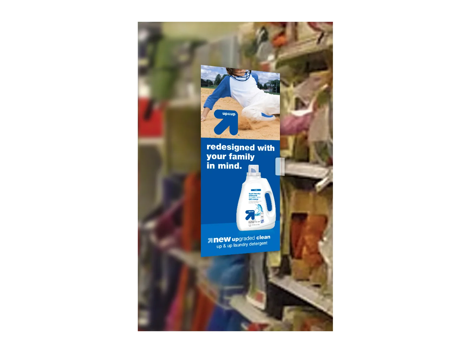
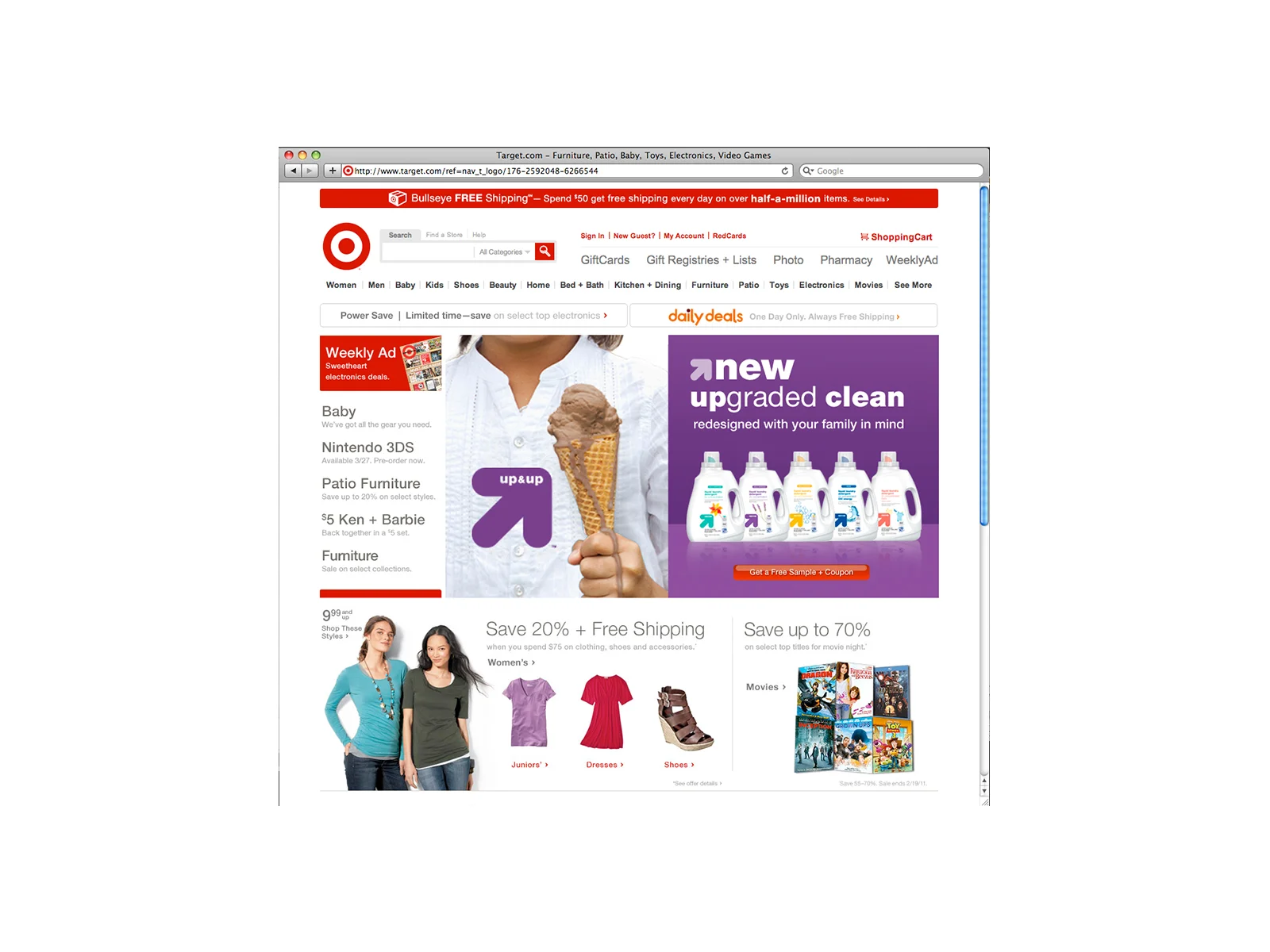
Sun Products had just improved the formula for Target's store brand up&up laundry detergent. It was reformulated to meet the needs of today’s family. They asked us how we would share this with the store shopper. Since an overarching theme was never developed for the brand, we established an overarching one and then showed how it could come to life in the laundry category We developed key visuals and then how it comes to life in print, in store and online.
The relaunch of WISK involved print, TV, shopper marketing, and package update. Sun Products was improving their formula and was going to compete against Tide. The new formula was effective and had the science to back it up.
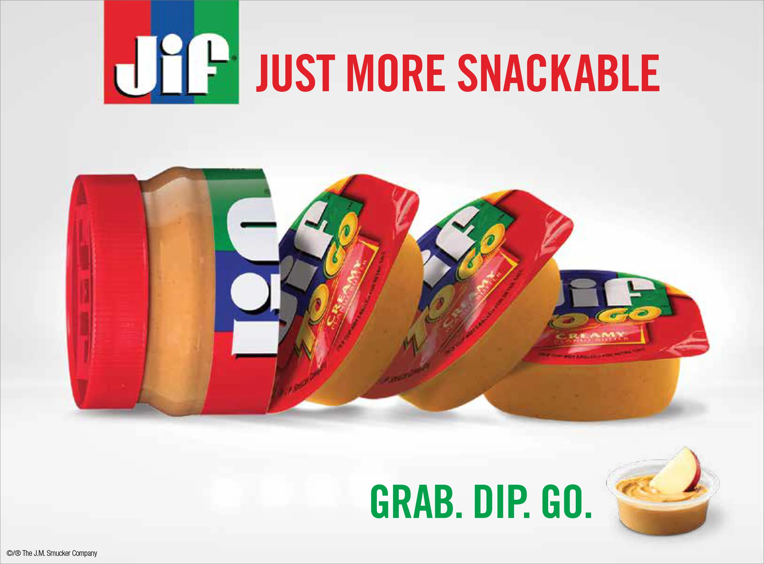
This key visual was created to convey to shoppers that the great taste they love in the jar can go with them anywhere. This visual was used for in store POS in the spreads and snack aisles, social, and banner ads. It was also featured on their home page carousel. This look was affectionately known by the client as “the macheté”.
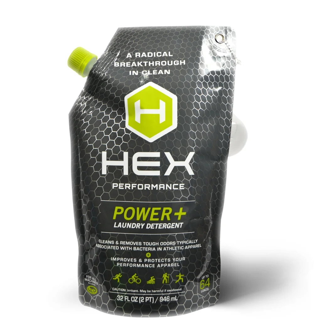
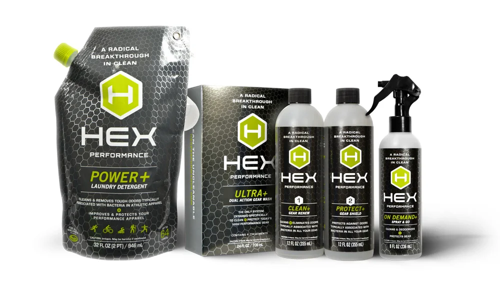
HEX PERFORMANCE Laundry Detergent is a special blend of ingredients that not only helps Mom clean the dirtiest and smelliest sports gear but also adds a layer of protection to protect with future use. Pack design and language needed to communicate this point of difference quickly and easily.
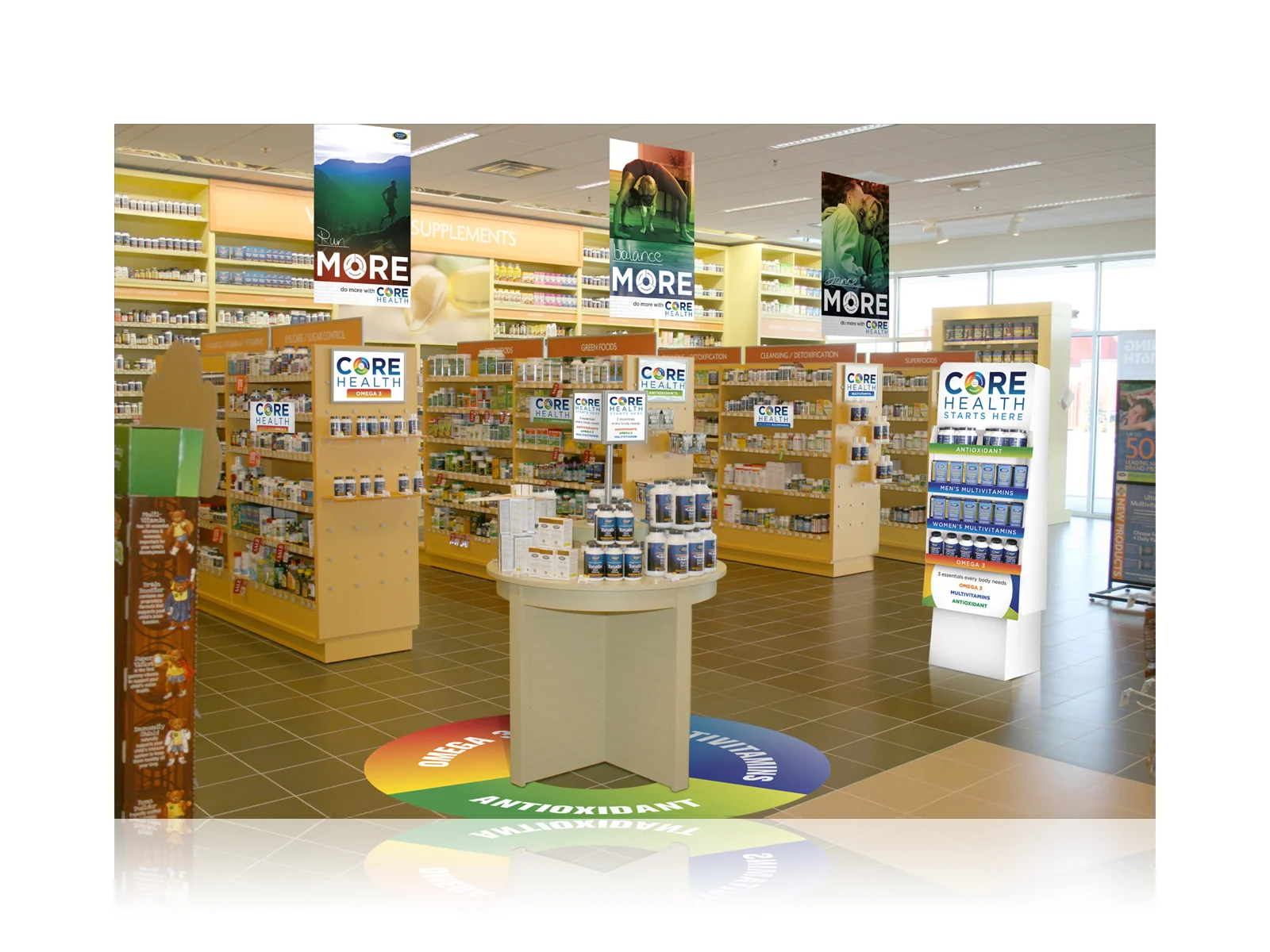
The VITAMIN SHOPPE asked us to help communicate the benefits of taking an antioxidant, omega 3, and multivitamin everyday and how it will positively affect your health. We established the Core Heath identity and communication. We were showing consumers that taking these three everyday would help them lead a richer life and allow them to do more. We were tasked with bringing this to life in store and online.
We recommended online support to help determine which options would be best for reaching personal goals.
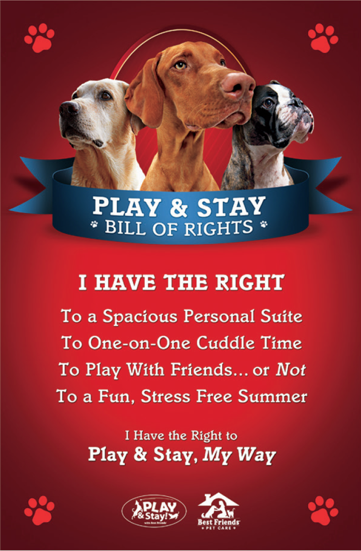
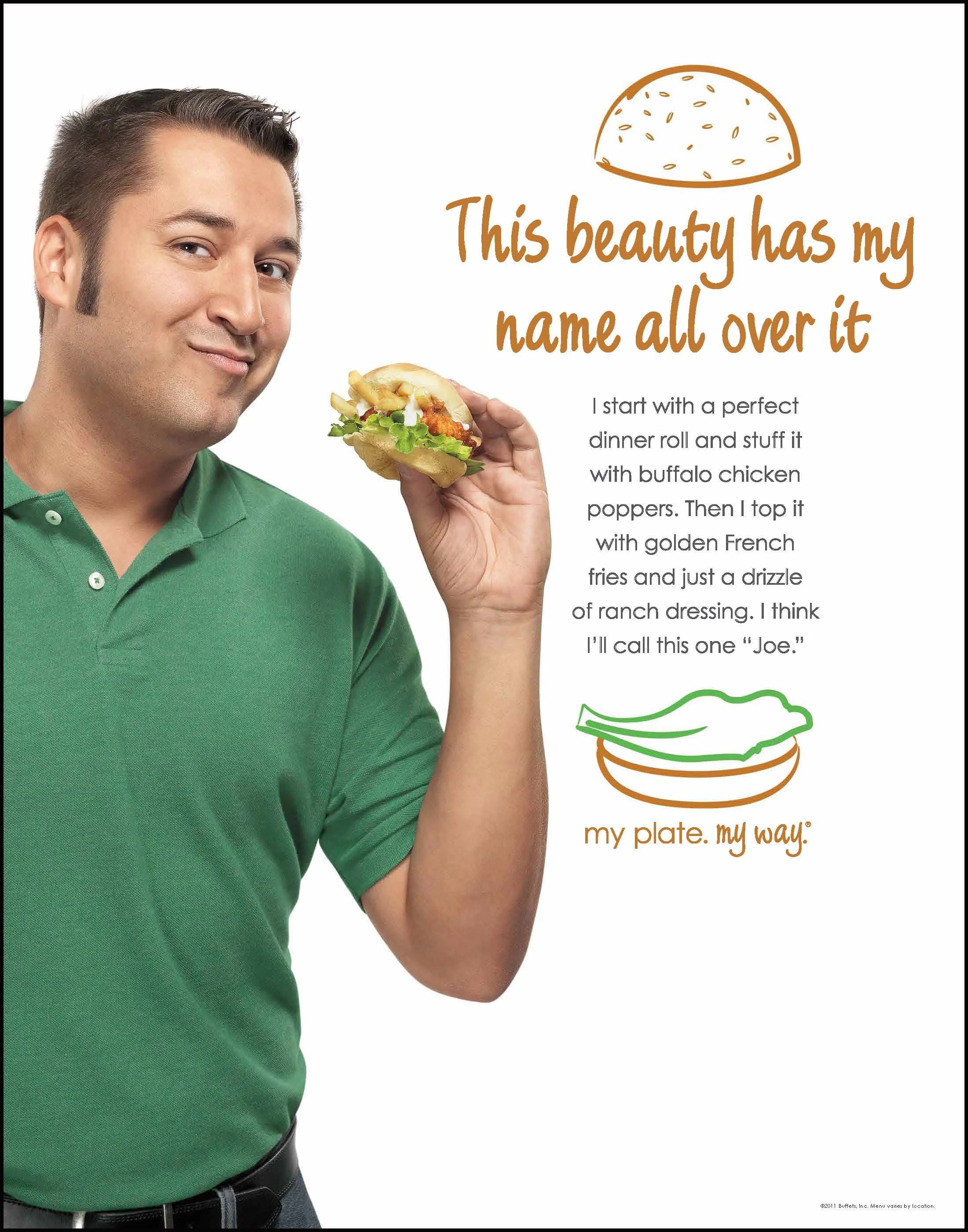
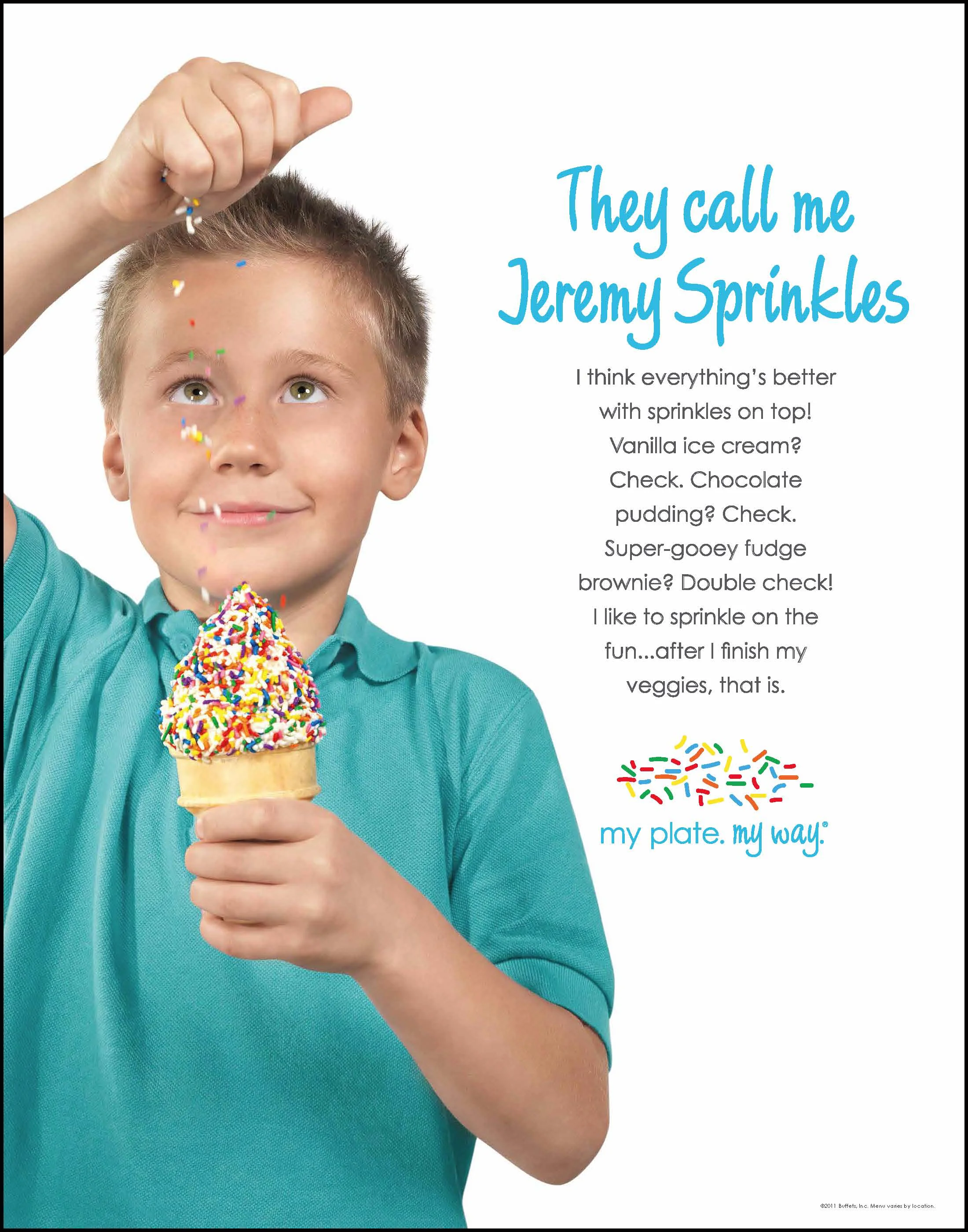
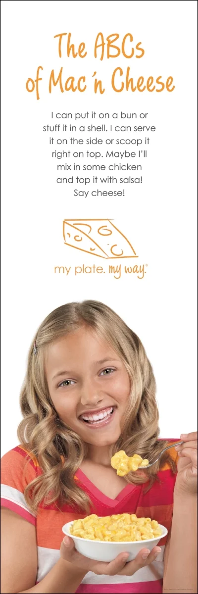
We created TV and posters that announced Buffets Inc. as the family destination of choice by emphasizing that every member gets exactly what they want.
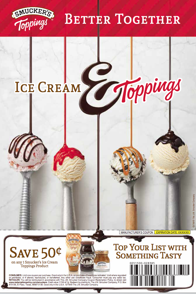
All brands of ice cream toppings were in decline or flat. The new wave of ice creams with mixed-in flavors have been pushing toppings off of the shopper's radar. Every retailer stocks their toppings in different areas of the store. Locating the toppings is quite a challenge as most are nowhere near the freezer section.
We created a key visual that reminded ice cream lovers about the great taste combinations of your favorite ice cream and Smucker's toppings.
The key visual was photographed in stages so it gave us and other agencies the flexibility to be used in shippers, print, online and social.
BE BETTER BAGS is a start up creating bags that are functional as well as creating awareness and doing good in the local community.
St. Edwards campus bags were sold to students and administrators with a portion of the proceeds going to the local food bank.
I D E N T I T Y
FIVE JANES is a boutique shop found in Washington Depot. It was reestablishing itself with a new name and ownership. The new identity was inspired by the owner’s close knit family who all share the same name and close bonds between them.
P E N D A N T N E C K L A C E S
Newtown and Southbury pendant necklaces were designed to celebrate pride in these hometowns. Iconic imagery from each town were converted to vector art for the final production.
S T A R S H O L L O W
One of Washington Depot’s yearly events is a Gilmore Girls’ Stars Hollow celebration. To commemorate the occasion, sustainable shopping bags were created to capture the fictional town and its memorable quotes.
Working with writers and art directors, we collaborated with writing, storyboarding and building animations for a several of our clients. These were built in After Effects and Edge Animate.